
The “Truthiness effect’ and its impact on your work
How images can misinform and mislead your audience; Mistakes to avoid when using charts or graphs; Why am I receiving The Factual Storyteller?

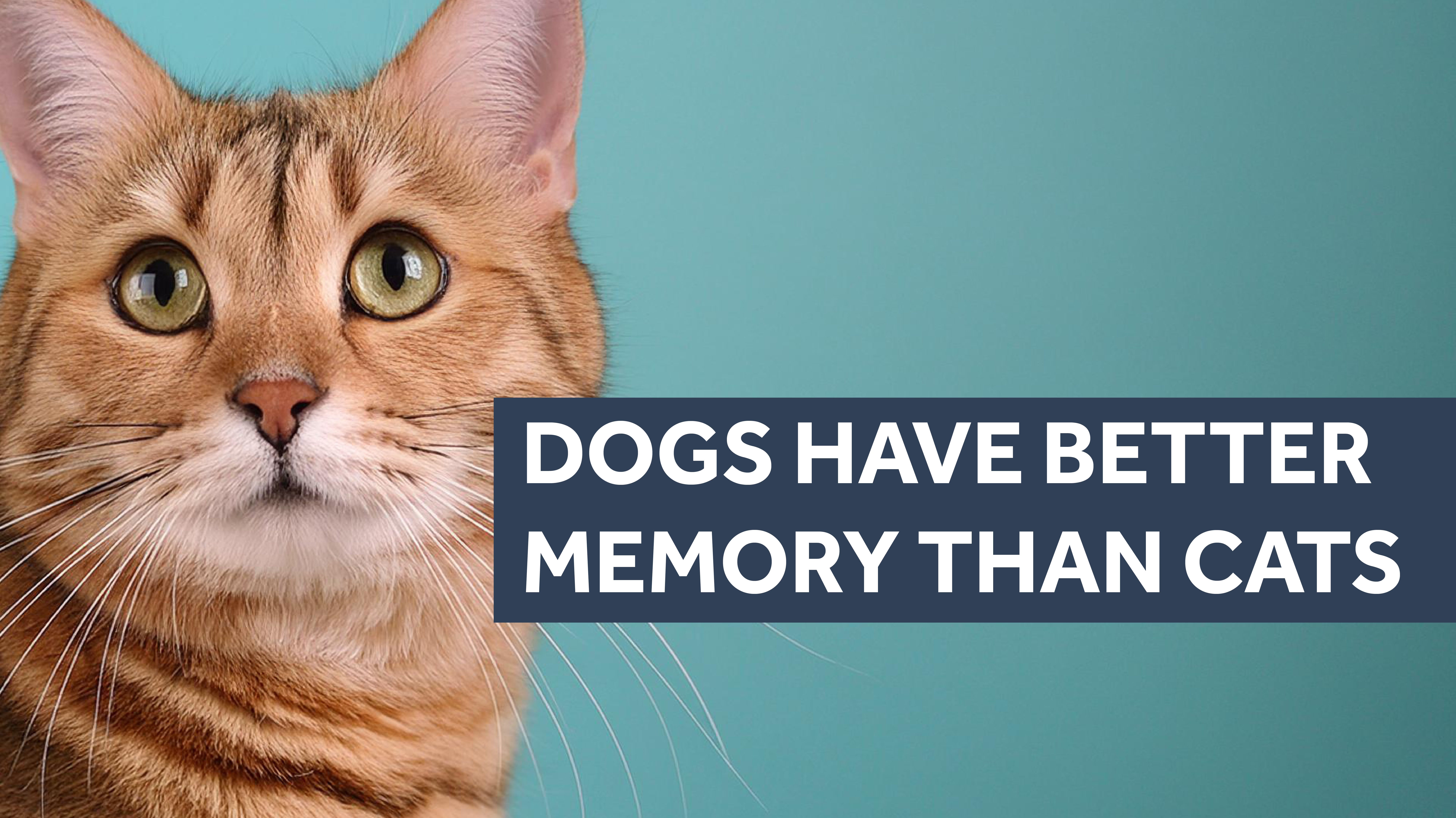
“Dogs have better memory than cats”.
Do you believe that?
More important, are you more likely to believe that statement if it is shown alongside an image of a dog?

Or alongside an image of a cat?
Research reveals there is a difference - and it is due to something known as the “Truthiness effect’.
Not only that, it offers some intriguing insights you should bear in mind whenever you use images to communicate about your work.
Because the images you choose can have a huge impact on how people perceive what you say.
Not only can they help increase the impact and comprehension of your message, they can also, in quite subtle ways, impair the understanding of your message, damage trust in your brand or organisation, and even create false or misleading memories of what you say.
To answer our initial question, people are more likely to believe the statement “Dogs have better memory than cats” when placed next to an image of a dog, than when placed next to cat.
That’s because the image of a dog helps our brains process the claim that dogs have better memories.

Whereas an image of a cat intrudes on our brains’ ability to process the same statement, which only starts to make sense when the word cat finally appears.

In short, the “Truthiness effect’ means that when a photo facilitates the processing of a claim, we are more likely to judge it as true.
When a photo impairs the processing of a claim, we are more likely to judge the claim as false.
So you can use this to your advantage when communicating about your work; by using photographs and graphics that accurately reflect and support your message, you will better help your audience understand, remember and believe what you are saying.
But there is a darker side to the “Truthiness effect’, you should be aware of…
Adding images that are semantically linked to your message, i.e. that are similar in meaning, will encourage people to believe what you say - whether the image actually adds any more evidence to support the truth of your message, or not.
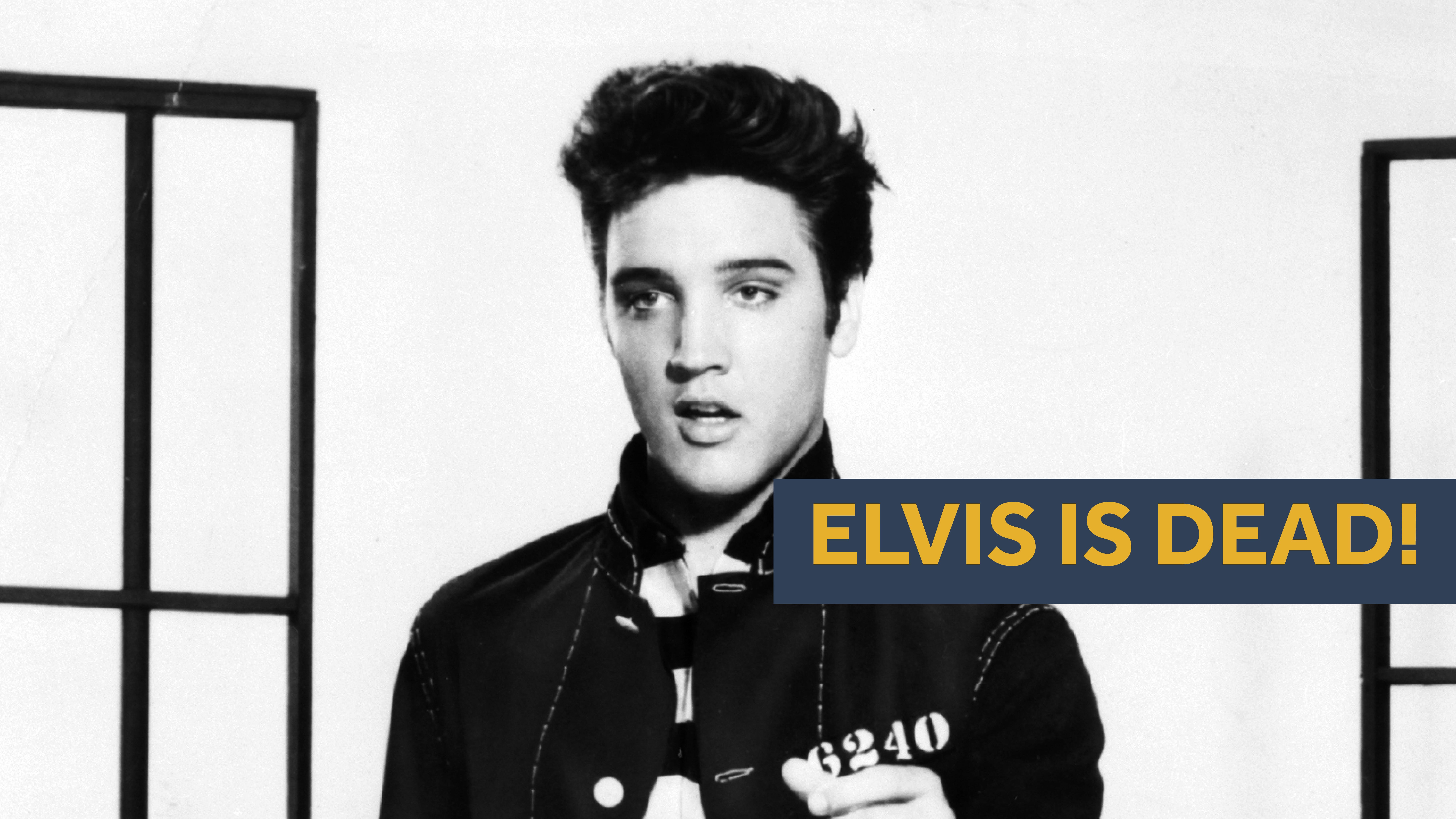
For example, people will rate the claim that a celebrity is alive as more likely to be true when also presented with a photo of the celebrity.
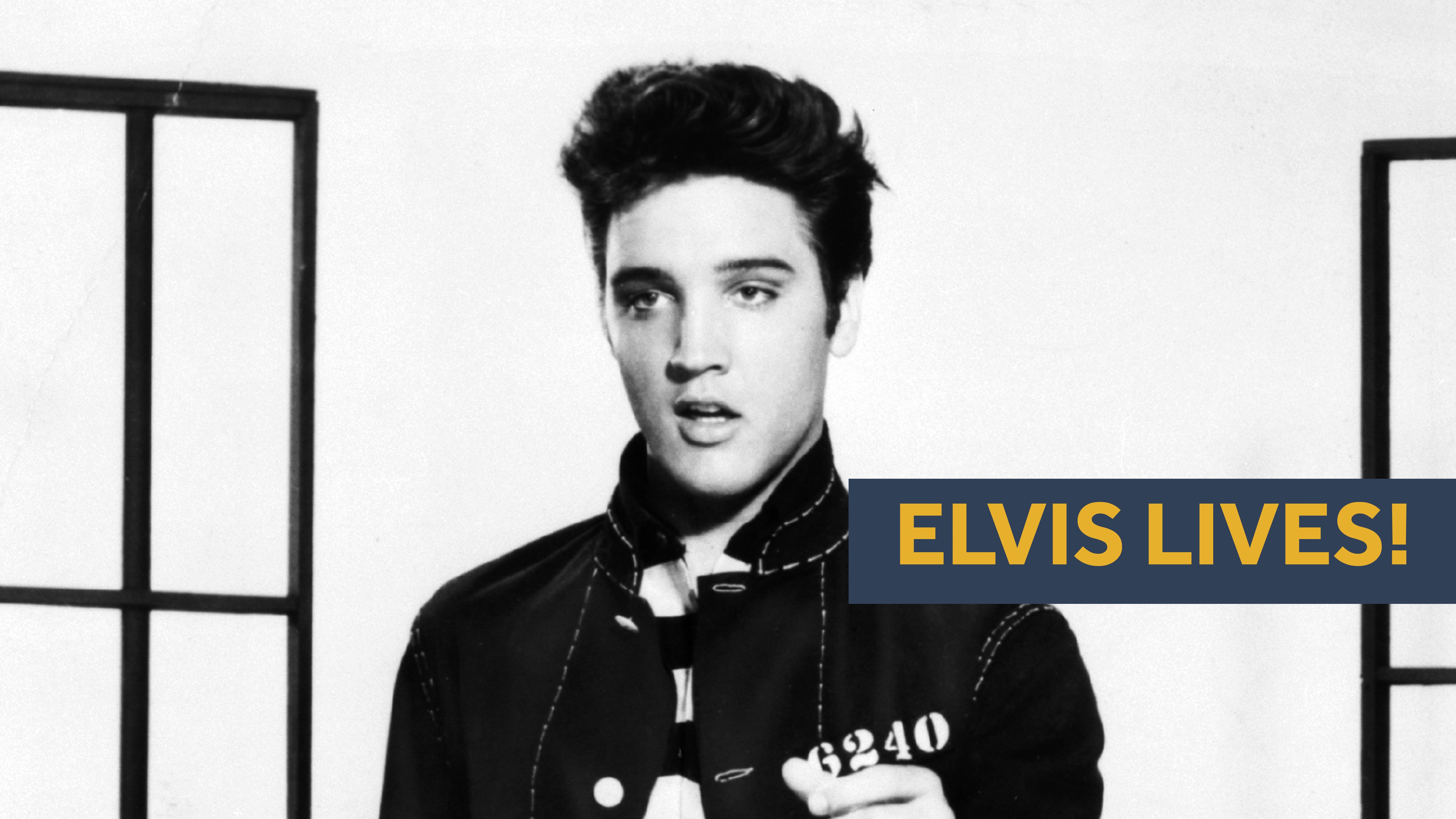
But they will be more likely to believe the opposite claim - that the celebrity is dead - if also published alongside an image of the same photo.
That’s because people don’t really view images as evidence.
Instead they use images to help them better understand the content they sit alongside.
According to researchers: “When information feels easy to process, and people can readily understand and imagine elements of a claim, they are more inclined to conclude claims are true.”
The work is published by Eryn Newman and Norbert Schwarz from The Australian National University in Canberra, and the University of Southern California in Los Angeles, US in a recent issue of the scientific journal Current Opinion in Psychology.
Worse, the “Truthiness effect’ means that images that are linked in meaning to a statement, can lead to people over-believing what they read alongside the image.
For example, after seeing a related but uninformative photo of a rainbow, people will claim they know more about how rainbows form. Despite there being no other information present that can help them better understand this complex process.

So the “Truthiness effect’ can inadvertently, or intentionally, be exploited to create misinformation.
False or misleading images can also create false memories.
According to the researchers, photos that depict information that goes beyond the text, for instance, by portraying possible conclusions to a story, can lead people to misremember having read those conclusions in the text.
For example, photos that provide a slanted representation of an event, such as amplifying danger, can lead people to misremember an event as having been worse than it was.
Reference: Misinformed by images: How images influence perceptions of truth and what can be done about it, by Eryn Newman and Norbert Schwarz. Current Opinion in Psychology 2024, 56:101778.
Mistakes to avoid when using charts or graphs
If you need to use charts of graphs at work, such as in presentations or reports, try to avoid this common mistake.
Avoid tilting and angling your graphs or charts.
Where possible, make sure any text placed on a chart or graph reads horizontally, left to right when using the English language and other Latin, Cyrillic, Indic or Southeast Asian languages.
A common mistake is to write y axis information vertically, or tilt axis labels or units, to make them fit the space.
When you do that, you’ve immediately made your information difficult to read, putting up a barrier to your audience accessing, engaging with and understanding the information you are trying to communicate.
For more insights, see our Factual Storytelling Course lesson When To Use Charts And Graphs.
Why am I receiving The Factual Storyteller?
We hope you like the newsletter which regularly shares tips, techniques and insights to help you better find stories in your work and professionally communicate with others.
You are receiving The Factual Storyteller newsletter because you will have either have directly signed up to receive new editions, followed us on the Substack platform, or you have recently enrolled in the Factual Storytelling Course. The newsletter is free, and you can unsubscribe at any time.